Second attempt!
1. I emphasized the words that are actually important to the message.
2. I got rid of some of the white space between words.
3. I kept it to three fonts.
4. Fonts that don’t come standard with MS Word.*
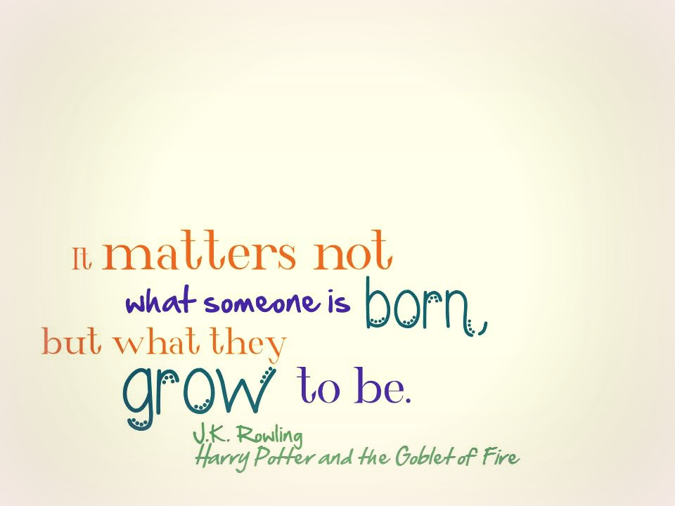
*Fonts (in order of appearance):
Wonderland by jully1780
Hand of Sean by Nice and Ripe Ltd
Wednesday by bythebutterfly.com
